April 30, 2016

Fairground: Space Octopus LEGO Ideas Project Review

Overview
This project seeks to add to the Fairground Creator theme The LEGO Group introduced in 2014 with the Fairground Mixer and then the Ferris Wheel in 2015. According to FungYup, the creator of the Space Octopus, the idea came for this project after getting the Ferris Wheel.

Appeals of the Project
Comparing to the existing fairground themed sets, the color scheme goes nicely with the Fairground Mixer, but also introduces some new colors in the in the mini planes where the minifigures set which complement the Ferris Wheel. I really like how the lights are integrated into the center of this build, reminding me of several real Space Octopus type rides I have been on, and the gold dome on top is like the crown on top of a really nice build.

Watching the video below, this really does look like an octopus with the way this ride moves, and I can just picture an actual octopus in the center! The design of the mechanism for this fairground ride is engineered beautifully. Not only does it allow the Space Octopus to spin, but causes the mini planes to move up and down in the vertical direction also. To me, this adds a very realistic feel to the Space Octopus when it is compared to how the actual ride would function.

There are many wonderful details to this project from the controls at the back of the drive shaft housing to the ticket booth, to the minor details on the mini planes. According to the project page, it is also possible to integrate a LEGO Power Functions motor allowing the Space Octopus can be operated hands free. Another modification mentioned on the project page is the possibility of replacing the mini planes with Starwars Microfighters, although this has yet to be pictured.


Areas for Improvement
One thing that I am not a fan of in this project is the minifigures. Although it nice that there are a large number of minifigures included in this project (nine based on the pictures) they are all exactly the same as the minifigures included in 10244 Fairground Mixer. It would be really nice to see some new minifigures replace these figures that have simply been "recycled" from an existing LEGO set.

Conclusion
Overall, this is a great project that would be a good addition to the Fairground themed sets if it reaches 10,000 supporters and passes the Official LEGO Ideas Review process. But it would be preferable if the "recycled" minifigures were replaced with new minifigures that are specific to this project. To see more pictures and offer your support, you can click here to visit this project on LEGO Ideas.

Photos/video used and review completed with the permission of FungYup.

April 23, 2016

Steam Rides Train Set LEGO Ideas Project Review


Overview
As the title indicates, this project by IsaacSmithLego, centers around a small steam engine. The goal of this project is to portray a classic steam engine similar to the Emerald Night with additional features such as a station as well as a signal and signal house according to the project page.

Appeals of this Project
From the start, this project has a very nicely rendered cover image, which makes it stand out among the many other projects in LEGO Ideas. I really like the size of this steam engine. It is very small and compact when compared with some of the other steam engines that LEGO has made in the past. The level of detail on this, from the gold stripes to the brick-built ladders to the handrails is very appealing. I especially like how the holes are covered on the sides piece 6222 at the front of the engine. It turns what would be somewhat of an eyesore and turns it into another level of detail. The colors used on the engine complement each other very nicely, from the dark red, to black, to dark gray, even to a little bit of the normal red color, and then it is all capped off with the gold stripes.

The coach is a good size for this engine. It is not too small, but it is not too large. It uses some common elements to create a very sophisticated appearance for what is most likely a just a standard coach car. I really like the use of the 1x1 round tiles on the roof of the car, providing some texture and creating a nice pattern. This train also has the option to incorporate LEGO's Power Function features, which is very attractive, as this provides another option for children as they play or for a collector to use as they display it running through their layout of a small town or countryside.

The inclusion of the platform station adds a nice touch, and offers another playability feature, and is also very aesthetically pleasing with a good balance of colors and textures. It reminds me of the old platform stations that might have been seen at a country stop for a real steam engine many years ago. The functioning signal is a great addition to increase the playability of the project, and it also looks great with the signal house behind it. I like that the control of the function is placed inside/behind the signal house and is not just a lever on the signal pole. This helps create a crisp, clean appearance while still allowing for great functionality.

Areas for Improvement
There is really only one area for improvement from my perspective. Although the option to include the Power Function system is nice, I do not like that adding it takes up the whole coach car. If there were some way to integrate the Power Function feature while using less than half the coach (ideally not in the coach car at all), that would be much more appealing to me as it would still allow for minifigures to be placed inside the coach while the train is running. However, with a build of this size, I do not see much of a way around this problem without a major redesign, and I would not want that as I think the steam engine looks great as is.

Conclusion
From one end of the train to the other, and from station to signal house, this is a fantastic project that offers great playability, and great aesthetic value. I think this would make a wonderful set if it reaches 10,000 supporters and passes the Official LEGO Ideas Review process. To see more pictures and to offer your support, you can click here to visit this project on LEGO Ideas.

The photos and review are used with the permission of IsaacSmithLego.

April 16, 2016

Butchers's Shop LEGO Ideas Project Review


Overview
This project is a butcher's shop created by Lightningtiger, where citizens of any LEGO town can come to purchase meat to fill their plastic stomachs. It is one of the many town themed projects that Lightningtiger has created and is based off of a real butcher's shop in Australia.

Appeals of this Project
Looking at the front of the building, the Butcher's Shop has some really nice features. The change in texture from the bottom third to the top section adds a nice contrast with the all white structure. I really like how the SNOT technique is used to create the dark red border around the front window, adding some contrast to the color of the building, and then again using a SNOT technique at the top to create the awning. The sign to the right of the door, advertising the various types of meat that are available for purchase makes good use of that narrow space and adds a nice touch.

Moving inside, the shop is full of the necessities that every butcher needs, from display counter, to a meat scale, and even a slicer. I really like how the inside surface of the display counter is slanted under the "glass" top, and the meat scale and meat slicer are very simple, yet still look realistic. The tile pattern really adds to the feel of a building that has been around for awhile, and the fact that the interior is not too crowded just adds to that old building feel when things were much simpler, not to mention the benefit of making playability much easier by allowing room for hands to get in without having to worry about disrupting the setup inside. It is nice to see the minifigures inside as this helps get a feel for the space, and I think two (the butcher and a customer) is the perfect number for a build this size.

Areas for Improvement
Overall, this is a nice building, but I think the addition of some more color would make it more aesthetically appealing. Adding some tan bricks to the lower/mid section of the building or making the awning dark red like the building it was based off of would not hurt. Alternatively, adding some plants in front of the store would go a long way to liven things up a bit. I also think it would be nice to include more types of meat inside the store. Some sausages/hot dogs of different colors would be a nice addition.

Conclusion
This is a really nice project overall. Although it could use some more color and maybe some more variety in the types and cuts of meat offered, I still think this project would fit in well with an existing LEGO town or city layout, and it would offer another option for playability as children send their minifigures to the butcher's shop to buy meat for dinner. I think this would be a nice set if it were to reach 10,000 supporters and pass the Official LEGO Ideas Review. To see more pictures and to offer your support, you can click here to visit this project on LEGO Ideas.

 The photos and review are used with the permission of Lightningtiger.

April 9, 2016

LEGO Store Modular Version LEGO Ideas Project Review


Overview
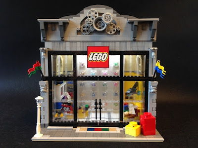
This project is made of LEGOs and is all about LEGO. Created by kashaka, this project is a Modular LEGO Store that is based off of the first stand alone LEGO Store which is located in New York City, New York, USA. Although this model is not identical to the Rockefeller Center LEGO Store, it does have some very nice similarities.

Appeals of this Project
The LEGO Store Modular Version is very appealing to view. I specifically like the largely "glass" front of the building as this lets a lot of light in, especially when combined with the sunlight that is located on the roof. The "glass" front is also very accurate to the design of the Rockefeller Center LEGO Store. Looking at the general architecture of the building, there is nice detailing in the corner columns and the gears at the top are a great addition. They fill up what would have been a bland space and leave room for the imagination: Maybe they were designed that way, maybe there was something there before that has since come down leaving the gears behind. Coming back down to street level, I really like the large LEGO 1x1 brick and 1x1 plate, and the models in the window are just like a real LEGO Store.

Moving through the doors is where the similarities to the Rockefeller Center LEGO Store become less noticeable. There is a Pick-A-Brick wall centered at the back of the store that is incredibly realistic, from the different colors, to the different shaped pieces, to how the cubbies protrude out of the wall. Looking around the store, there are many different colored boxes, which represent different types of sets. According to the project page, "Dark gray is for Star Wars, red is for Super Heroes, blue is for City, purple and pinks are for Friends, dark blue is for Modular, green is for Ninjago and black is for Technic." Going around to the back of the store, there is a storage area, for shipments of new sets and more Pick-A-Brick pieces, much like a real LEGO Store, although I have never been in the back of a LEGO Store to know what it actually looks like.

Areas for Improvement
From top to bottom, this is a really solid project, and I cannot think of much that needs to be improved. The only thing that comes to mind is the overall size of the build itself might be too large to pass the official LEGO Ideas Review. Although this is a fantastic project, it is also a large project, and historically large projects have not passed the Official LEGO Ideas Review process. However, I think this Modular LEGO Store has the best chance to pass the Review stage compared to other large projects I have seen because, although it is large on the exterior, it has lots of empty space on the interior since there is only one floor. Other modular buildings that reached 10,000 supporters had multiple floors and would have been too expensive to produce, but having only one floor in this build could help it in the LEGO Review Stage.

Conclusion
I really like this LEGO Store Modular Version, and think that it offers great appeal to LEGO fans of all ages because of the playability potential and the aesthetic appeal of the of both the interior and exterior. Although it is large, I do believe it has a shot to pass the Official LEGO Ideas Review and become a set if it reaches 10,000 supporters. To see more pictures and to offer your support, you can click here to visit this project on LEGO Ideas.

The photos and review are used with the permission of kashaka.

April 2, 2016

Robin Hood Peddler's Wagon LEGO Ideas Project Review


Overview
This is a project created by ootkaman on LEGO Ideas, and is based off of the "Robin Hood ballads, in which Robin Hood and Little John ride a peddler's wagon that has secret compartments for weapons and Merry Men," according to the project page. For those who may not be familiar with the story of Robin Hood, he is a hero of old English folklore who, along with his band of Merry Men, hide out in Sherwood Forest, robbing the rich to feed the poor, and thus was often at odds with the gentry and the law.
 
Appeals of this Project
The Peddler's Wagon contains Robin Hood and Little John driving a peddler's wagon, a lookout tree for one of Robin Hood's Merry Men, and the Sheriff of Nottingham, giving this project great playability potential. The wagon had a number of accessories on the outside making it look very genuine, thus allowing Robin Hood to sneak past the Sheriff. The wagon also has several compartments, one on each side to hide the weapons and a hidden compartment underneath where Merry Men can be smuggled past the watchful eye of the Sheriff. I really like how the hidden compartments cannot be seen from the outside, making the wagon look just like any ordinary peddler's wagon, and the placement of the compartment under the wagon for the Merry Men is my personal favorite. It looks just ordinary paneling, but is really a secret hiding place!
The lookout tree is wonderfully done with handholds in the back allowing the Merry Men to climb up and keep an eye out for the Sheriff of Nottingham. The inclusion of the tree, also really brings the project together, both with a balance of the colors and the options for playability. It is even possible that the Sheriff could climb up the tree to spy on Robin Hood and Little John. The possibilities are limited only by your imagination.
Areas for Improvement
One area where I think this project could be improved is the layout of the interior. Personally, I feel that if the current layout makes it difficult to hide the compartments on the outside of the wagon because the interior is only two studs wide. If it the interior could be made four studs wide, maybe by attaching the weapons to the back of the folding side panel on the wagon and using the panel piece 4215 right up against the folding side, it would make it much more believable that this was just an ordinary peddler's wagon, thus helping Robin Hood and Little John to sneak the weapons past the watchful eye of the Sheriff.
 
Conclusion
This is a really nice project that offers great playability looks good at the same time. There is still room for a little bit of improvement, but overall, I think this would make a fantastic set if it reaches 10,000 supporters and passed the official LEGO Ideas Review. To see more pictures and to offer your support, you can click here to visit this project on LEGO Ideas.

The photos and review are used with the permission of ootkman.